critiques
critiques
critiques
Testing pool
The study would have benefitted from a larger sample, equally trained/untrained on the scrolling mechanisms of the prototype and testing across varying levels of iOS proficiency.
Research
More intentional interviews with qualitative questions based on hypothesis and more in-depth observation sessions could have been used to guide better prototype development.
Testing pool
The study would have benefitted from a larger sample, equally trained/untrained on the scrolling mechanisms of the prototype and testing across varying levels of iOS proficiency.
Testing pool
The study would have benefitted from a larger sample, equally trained/untrained on the scrolling mechanisms of the prototype and testing across varying levels of iOS proficiency.
Research
More intentional interviews with qualitative questions based on hypothesis and more in-depth observation sessions could have been used to guide better prototype development.
Research
More intentional interviews with qualitative questions based on hypothesis and more in-depth observation sessions could have been used to guide better prototype development.
Categorization
Category groupings should be refined based on additional user feedback and testing. These can help optimize icon selection and minimize the search function, ultimately requiring the user to do less. * Future case. stuydies
Categorization
Category groupings should be refined based on additional user feedback and testing. These can help optimize icon selection and minimize the search function, ultimately requiring the user to do less. * Future case. stuydies
Categorization
Category groupings should be refined based on additional user feedback and testing. These can help optimize icon selection and minimize the search function, ultimately requiring the user to do less.
key results
key results
usability testing
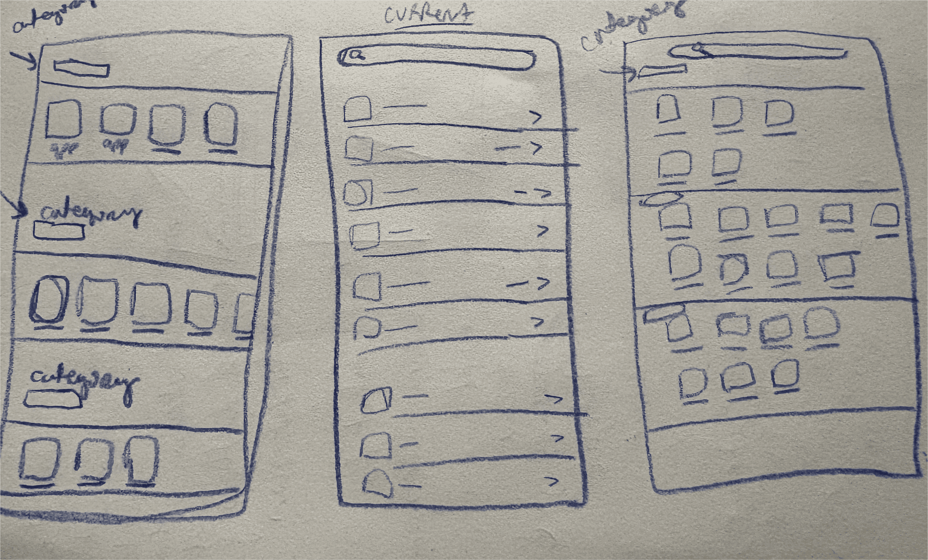
low-fidelity sketches
low-fidelity sketches
These six low-fidelity sketches explore alternative navigation models for app settings, including horizontal scrolling, folded vertical drawers, icon-based groupings, and card galleries.
Each concept aims to move beyond the default linear list layout (labeled current).
These six low-fidelity sketches explore alternative navigation models for app settings, including horizontal scrolling, folded vertical drawers, icon-based groupings, and card galleries.
Each concept aims to move beyond the default linear list layout (labeled current).
hover for more
tap for more

prototype decisions
prototype decisions
prototype decisions
I prototyped only the singular-column/row sketches. Multi-column designs would create an unfair comparison to the default list format of the iOS settings menu.
Ideas such as collapsable labels or gallery styled card groupings that emphasize arbitrary categorization were also abandoned.
Furthermore, prototypes show 4-8 more apps on screen than what is possible in the default list format, and aim to address the excessive scrolling pain point.
prototypes
prototypes
excessive scrolling
excessive scrolling
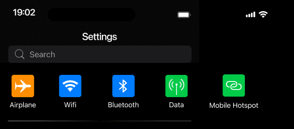
Users reported the current list format of the iOS settings menu takes a long time to scroll through.
Users reported the current list format of the iOS settings menu takes a long time to scroll through.
icon identification
icon identification
Users lack systems in place to increase icon recognition, and thus exhibit over reliance on the search function.
Users lack systems in place to increase icon recognition, and thus exhibit over reliance on the search function.
unclear categorization
unclear categorization
Ambiguous groupings frustrate users who expect familiar or consistent app structures
Ambiguous groupings frustrate users who expect familiar or consistent app structures
I shadowed 6 participants—both in-person and via screen share—as they navigated through the iOS Settings menu. This allowed for real-time insight into their behaviors, navigation patterns, and pain points.
I shadowed 6 participants—both in-person and via screen share—as they navigated through the iOS Settings menu. This allowed for real-time insight into their behaviors, navigation patterns, and pain points.
~ 2 in person observations. 4 screen shares.
~ 2 in person observations. 4 screen shares.
~ 2 in person observations. 4 screen shares.
~ Users asked to think aloud as I took notes.
~ Users asked to think aloud as I took notes.
~ 2 minutes of shadowing
~ 2 minutes of shadowing
~ Age range 23 - 56.
~ Age range 23 - 56.
observation
observation
interviews
interviews
I conducted interviews with iPhone users at varying levels of technical proficiency (low, moderate, and advanced). Each interview revealed frustrations with the layout of the current iOS Settings structure.
I conducted interviews with iPhone users at varying levels of technical proficiency (low, moderate, and advanced). Each interview revealed frustrations with the layout of the current iOS Settings structure.
~ 3 interviews
~ 3 interviews
~ 3 interviews
~ 5 minutes in length
~ 5 minutes in length
~ Ages range 23 - 60
~ Ages range 23 - 60
~ 2 follow-up qualitative questions
~ 2 follow-up qualitative questions
Online critiques from sources such as Reddit, iPhone Life, and TidBITS highlighted widespread dissatisfaction with the lack of intuitive organization in the iOS Settings menu and overall feeling of overwhelm.
Online critiques from sources such as Reddit, iPhone Life, and TidBITS highlighted widespread dissatisfaction with the lack of intuitive organization in the iOS Settings menu and overall feeling of overwhelm.
secondary
secondary
research
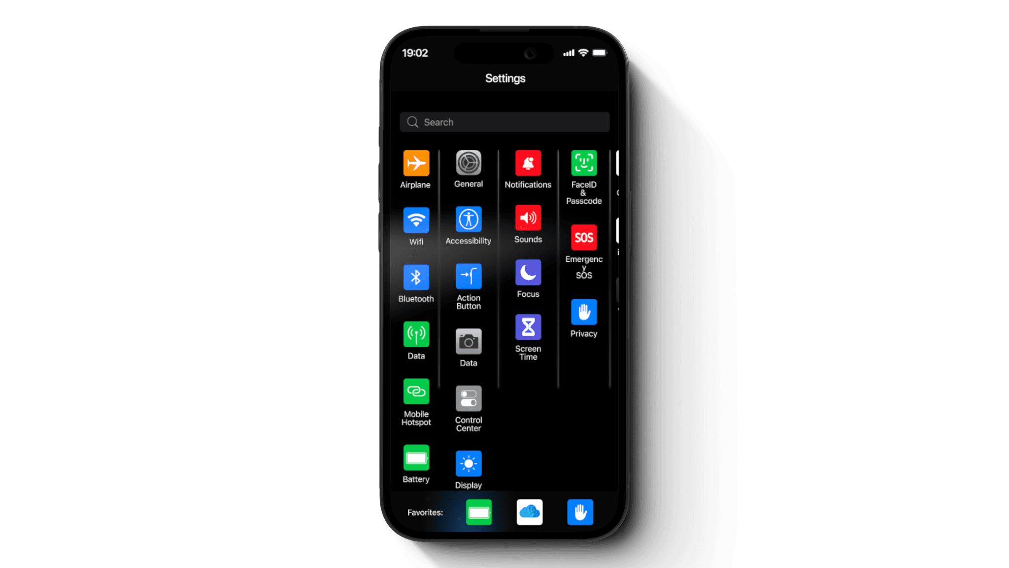
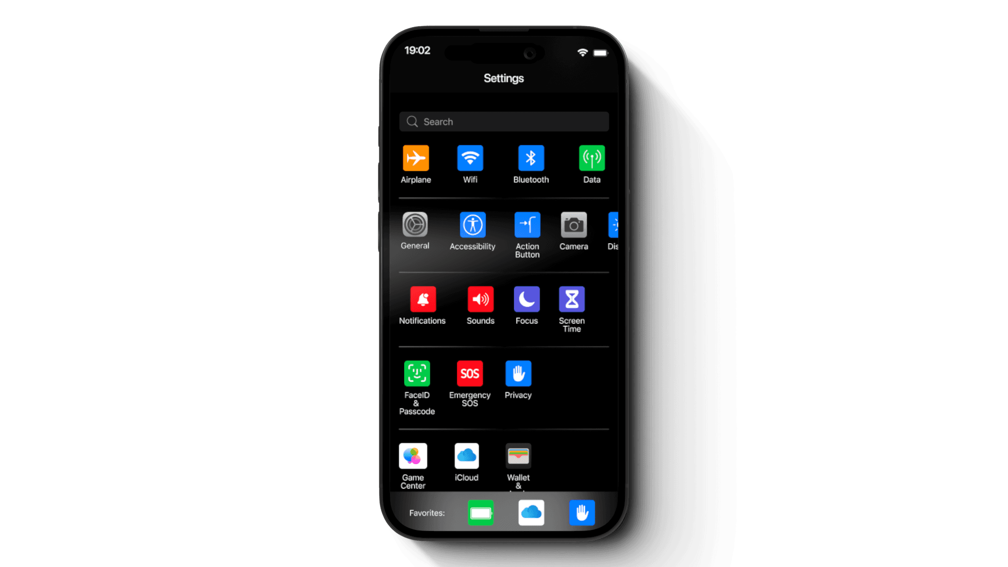
icons
icons
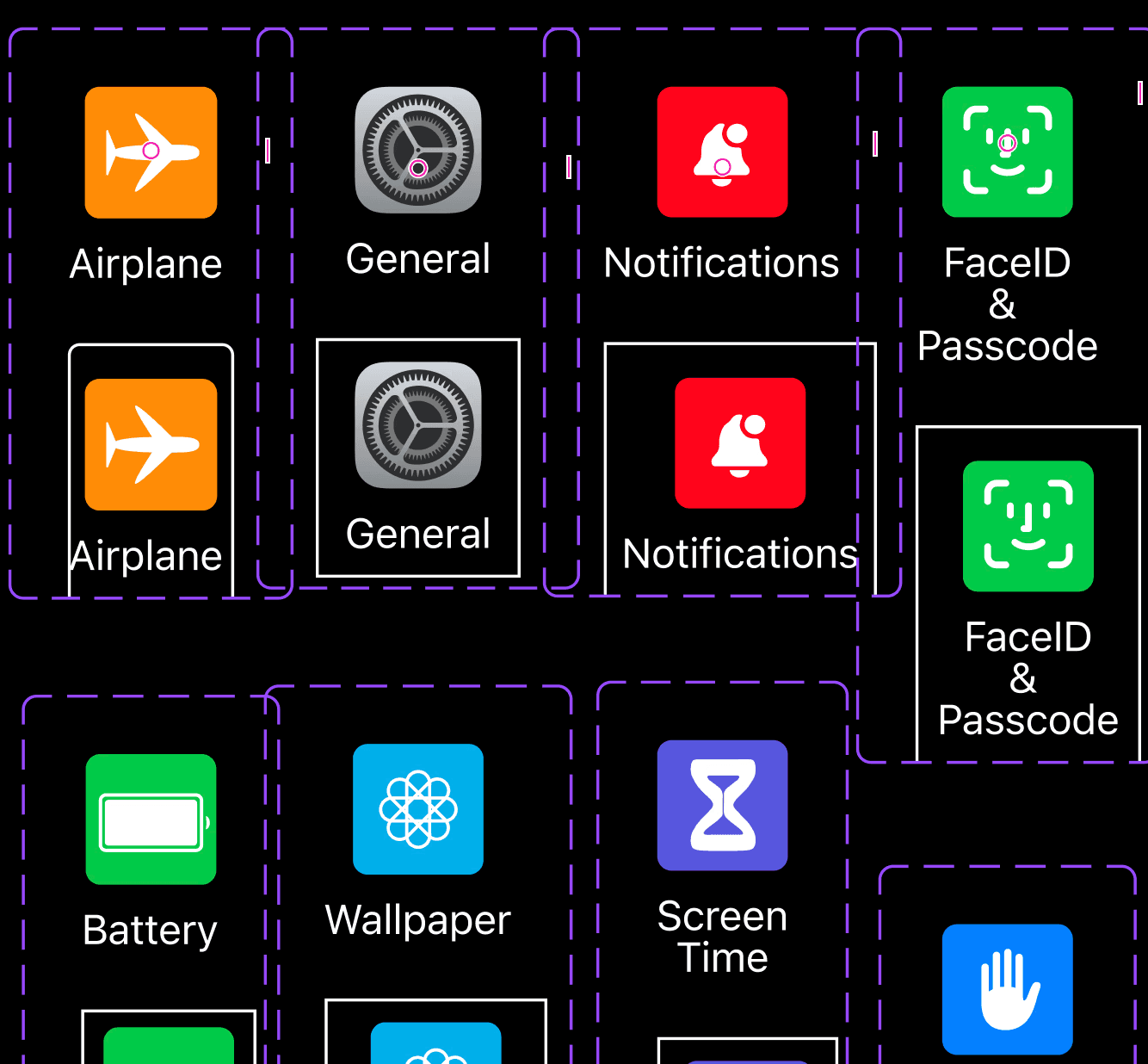
Components and variants (with a square outline indicating the chosen icon) were used in place of actual screen transitions to show when user has selected an icon.
Components and variants (with a square outline indicating the chosen icon) were used in place of actual screen transitions to show when user has selected an icon.
Prototypes used larger icons while still maximizing screen real estate as a simple way to address the icon recognition complaint.
Prototypes used larger icons while still maximizing screen real estate as a simple way to address the icon recognition complaint.
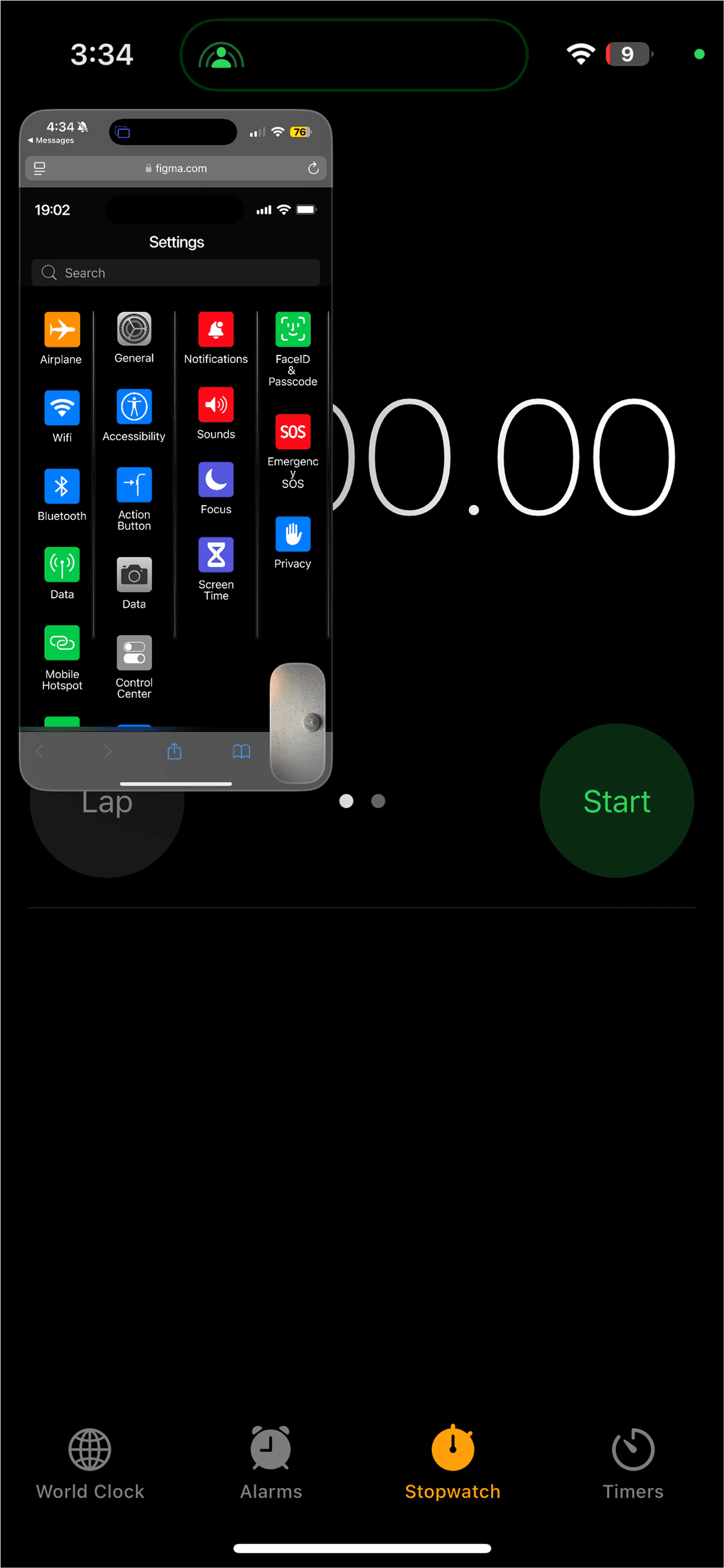
vertical-scrolling prototype
vertical-scrolling prototype
vertical-scrolling prototype
A columnar layout with vertically scrolling columns is enclosed within a grouped frame that scrolls horizontally to reveal the remaining apps.
A columnar layout with vertically scrolling columns is enclosed within a grouped frame that scrolls horizontally to reveal the remaining apps.
A columnar layout with vertically scrolling columns is enclosed within a grouped frame that scrolls horizontally to reveal the remaining apps.
Users have minimal horizontal scroll action to get to the bottom categories of their list.
Users have minimal horizontal scroll action to get to the bottom categories of their list.
Users have minimal horizontal scroll action to get to the bottom categories of their list.
Users also benefit from the having their longest app columns in the first two sections in this layout and within a finger map heat zone.
Users also benefit from the having their longest app columns in the first two sections in this layout and within a finger map heat zone.
Users also benefit from the having their longest app columns in the first two sections in this layout and within a finger map heat zone.
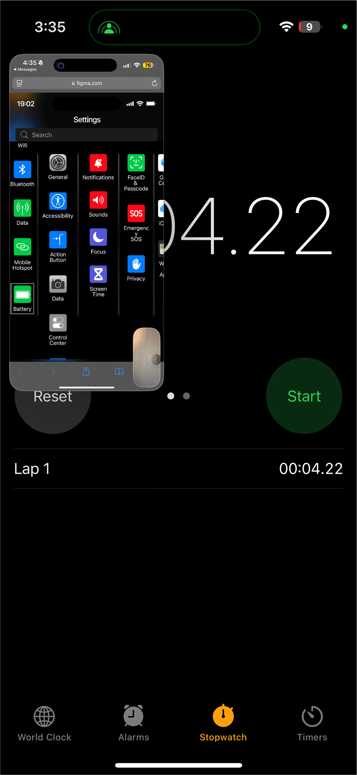
horizontal-scrolling prototype
horizontal-scrolling prototype
horizontal-scrolling prototype
A row based layout with horizontally scrolling row enclosed in a frame that scrolls vertically to reveal the remaining apps.
A row based layout with horizontally scrolling row enclosed in a frame that scrolls vertically to reveal the remaining apps.
A row based layout with horizontally scrolling row enclosed in a frame that scrolls vertically to reveal the remaining apps.
Users are capable of seeing all categories of their list in this layout.
Users are capable of seeing all categories of their list in this layout.
Users are capable of seeing all categories of their list in this layout.
However, a disadvantage is the longest app rows at the top are outside of the finger heat map zone, potentially proving to be unintuitive for the average user.
However, a disadvantage is the longest app rows at the top are outside of the finger heat map zone, potentially proving to be unintuitive for the average user.
However, a disadvantage is the longest app rows at the top are outside of the finger heat map zone, potentially proving to be unintuitive for the average user.
setup
setup
Participant Familiarity Assessment
Participants were asked to rate their familiarity with the current iOS settings layout and self-assess their user proficiency.
Testing Instructions
Participants were briefed on how to use the scrolling action prior to testing.
Participant Familiarity Assessment
Participants were asked to rate their familiarity with the current iOS settings layout and self-assess their user proficiency.
Testing Instructions
Participants were briefed on how to use the scrolling action prior to testing.
Participants: Ten users tested three different menu layouts: Default (current iOS layout), Horizontal, and Vertical.
Participants: Ten users tested three different menu layouts: Default (current iOS layout), Horizontal, and Vertical.
task
task
Testing Procedure
Conducted 10 remote (via FaceTime screen share) and 2 in-person usability tests.
2 participants were not debriefed on how to use scrolling action of prototype.
Participants were tasked with locating specific icons in three layouts:
Default iOS settings layout
Vertical prototype layout
Horizontal prototype layout
Task Details
Task 1: Locate an app/icon visible on the screen without scrolling.
Task 2: Locate an app/icon requiring a scrolling action.
Timing and Performance
Participants were timed as they searched for specific settings/icons in each layout.
before user selection
before user selection
after user selection
after user selection
feedback
feedback
User Feedback Collection
Participants were asked to share frustrations and challenges with the current iOS settings layout after completing the tasks.
User Feedback Collection
Participants were asked to share frustrations and challenges with the current iOS settings layout after completing the tasks.
2 participants explicitly noted that the prototypes were more "icon-focused or icon-centered" compared to the default layout. Both of these users then made quicker on-screen selections with the horizontal prototype without requiring scrolling.
2 participants explicitly noted that the prototypes were more "icon-focused or icon-centered" compared to the default layout. Both of these users then made quicker on-screen selections with the horizontal prototype without requiring scrolling.
2 participants explicitly noted that the prototypes were more "icon-focused or icon-centered" compared to the default layout. Both of these users then made quicker on-screen selections with the horizontal prototype without requiring scrolling.
insights
try prototypes
try prototypes
Reduce Scrolling Dependency
Scrolling actions can be a barrier for uninformed users. Minimize scrolling requirements or provide visual cues to guide users effectively through the layout.
Reduce Scrolling Dependency
Scrolling actions can be a barrier for uninformed users. Minimize scrolling requirements or provide visual cues to guide users effectively through the layout.
Reduce Scrolling Dependency
Scrolling actions can be a barrier for uninformed users. Minimize scrolling requirements or provide visual cues to guide users effectively through the layout.
Optimize Horizontal Navigation
Horizontal focused prototype demonstrated superior performance for on-screen selections. Consider implementing horizontal layouts and F-shape patterns in areas of menus where it might streamline navigation.
Optimize Horizontal Navigation
Horizontal focused prototype demonstrated superior performance for on-screen selections. Consider implementing horizontal layouts and F-shape patterns in areas of menus where it might streamline navigation.
Optimize Horizontal Navigation
Horizontal focused prototype demonstrated superior performance for on-screen selections. Consider implementing horizontal layouts and F-shape patterns in areas of menus where it might streamline navigation.
Support Icon-Centric Design
Utilize visually intentional compositions to enhance icon recognition and reduce cognitive load during navigation. This can be achieved with intentional use of whitespace as much as actually icon manipulation.
Support Icon-Centric Design
Utilize visually intentional compositions to enhance icon recognition and reduce cognitive load during navigation. This can be achieved with intentional use of whitespace as much as actually icon manipulation.
Support Icon-Centric Design
Utilize visually intentional compositions to enhance icon recognition and reduce cognitive load during navigation. This can be achieved with intentional use of whitespace as much as actually icon manipulation.
Icon Recognition
User research and observations prove that navigation patterns vary based on app familiarity. In response, I added a dynamic favorites bar to the prototype. Powered by AI, it adapts over time to display the user's most visited apps.
Icon Recognition
User research and observations prove that navigation patterns vary based on app familiarity. In response, I added a dynamic favorites bar to the prototype. Powered by AI, it adapts over time to display the user's most visited apps.
Icon Recognition
User research and observations prove that navigation patterns vary based on app familiarity. In response, I added a dynamic favorites bar to the prototype. Powered by AI, it adapts over time to display the user's most visited apps.

click phone to visit
excessive scrolling
Users reported the current list format of the iOS settings menu takes a long time to scroll through.
icon identification
Users lack systems in place to increase icon recognition, and thus exhibit over reliance on the search function.
unclear categorization
Ambiguous groupings frustrate users who expect familiar or consistent app structures
problems
usability testing
Testing Procedure
Conducted 10 remote (via FaceTime screen share) and 2 in-person usability tests.
2 participants were not debriefed on how to use scrolling action of prototype.
Participants were tasked with locating specific icons in three layouts:
Default iOS settings layout
Vertical prototype layout
Horizontal prototype layout
Task Details
Task 1: Locate an app/icon visible on the screen without scrolling.
Task 2: Locate an app/icon requiring a scrolling action.
Timing and Performance
Participants were timed as they searched for specific settings/icons in each layout.
before user selection
after user selection
User Feedback Collection
Participants were asked to share frustrations and challenges with the current iOS settings layout after completing the tasks.
insights
icons
Components and variants (with a square outline indicating the chosen icon) were used in place of actual screen transitions to show when user has selected an icon.
Prototypes used larger icons while still maximizing screen real estate as a simple way to address the icon recognition complaint.

Connect
stream1ineui@gmail.com
dribbble
Shawn Duncan
© Copyright 2024